
I chose the work of Beardsley as I have always liked the style of the work and producing the PowerPoint was relatively straightforward. Creating art in his style however is a different thing. The style is quite unique and his subject matter is quite racy, but I have looked at going back to his roots and influence by Japanese wood block printing.
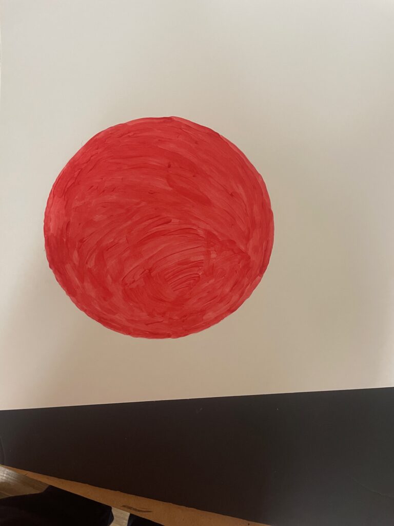
next issue is to choose the media and also the imagery. The red orb is evocative of Japanese woodcuts (though some of Beardsley’s influences may well have been more figurative and less abstract, so starting there seems a good idea. First effort was to use conte as its a medium i am comfortable with, and should produce a fairly uniform color. of course the usual problems come to light with smudging using conte – though i should hopefully be able to address them or switch to wax pastel,,,,

Next option was wax conte – not happy at all with how that was looking and wondered if I could get a richer red – so decided to have a go with red food coloring

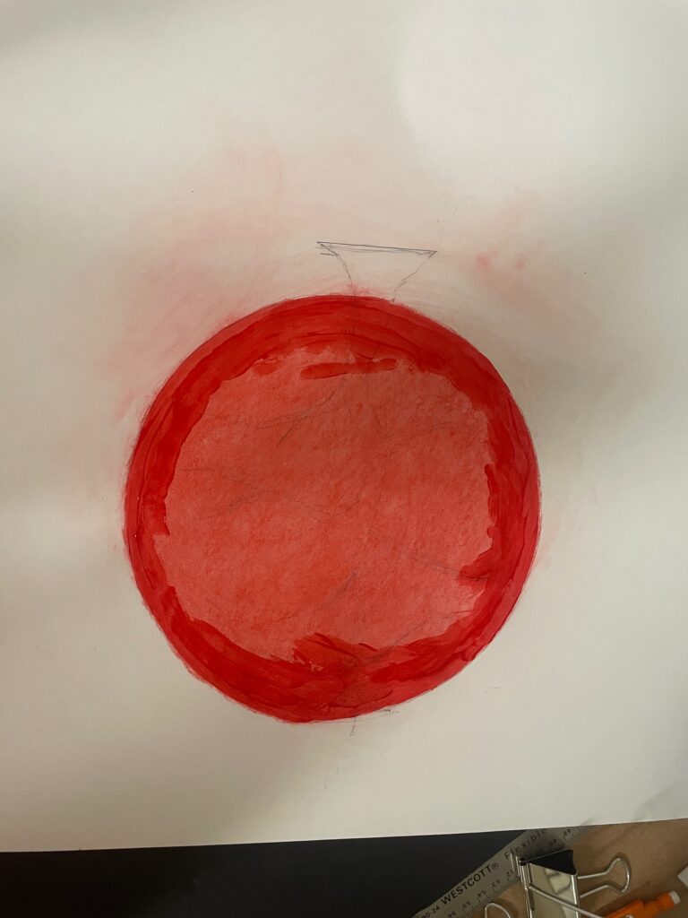
am happy with the mask imagery as it is consistent with Beardsley’s style but want to have several different images and therefore took a look at using watercolor

quite like the watercolor but don’t feel it goes well in combination with the food coloring

so have decided to overpaint the pastel which hopefully means i will be able to place another image on top without smudging, plus another watercolor sphere, planning on using the mask imagery on one and a raven on another, even though the raven doesn’t feature much in Beardsley’s work, that gothic feel i think is consistent with some of his images. then am planning on adding some sweeping ink lines in the style of the peacock skirt
In the end I chose a triptych – the mask image on a revised watercolor background the hairstyle from the peacock skirt and a raven – the raven is not a symbol you specifically see in Beardsley’s work but it has a similar gothic feel tome of the symbols he uses
also added some ink lines riffing off the flow in many of his drawings


and here the same with the images swapped

Unit 2 – reflection. This project was quite a learning process. Taking a research project and seeing it through to my own artwork. I am happy with my choice of artist, as Beardsley’s work was quite nostalgic for me, and i like his edgy style. As I mentioned in the presentation I first saw his work 50 years ago, and for a while had a couple of art books of his work, which disappeared many years ago. I enjoyed the presentation. Over the years I have spoken at many venues on a whole range of topics and I try hard to engage my audience. I feel a number of my classmates could benefit with some help and suggestions about presenting – particularly if using media such as PowerPoint. It’s really important not to crowd the slides or notes with massive amounts of information – just use the images as a prompt, and also reading verbatim isn’t great – its not possible to engage an audience when reading from a script or a phone. Creating the piece presented several challenges. I knew i didn’t have the skills necessary to create drawings with Beardsley’s finesse so i looked for images emblems and motifs which might at least capture some of his essence. The use of materials was also a challenge. The red circle was going to be a core element and my first shot used chalk pastel as I felt I could get an even coloration using that media. Pastel however is so sensitive to smudging and it became clear I was going to need something different/. Had a shot with red food color, but found it too garish, so settled on watercolor. I hadn’t realized you could get watercolor paints in tubes – which are a lot handier than tablets – so that really helped for this and for future work. The mask, hair and raven emblems were reasonably straightforward, and I feel they had a connection to the artist even if i didn’t see the raven in any of his drawings, it had that gothic type of vibe. but the big move was trying to get his defining sweeping lines with a brush and ink. I did a couple of practice runs which were OK, but there’s no going back once you start applying ink to the work which you have already spent a lot of time on. I was not entirely happy with all the marks but felt they at least had some sense of the artist. I enjoyed the positive comments during critique, but sometimes in this class full of such talented people i wonder if I’m the village idiot that people are just humoring….I do know however that my confidence has grown during the class and there are a few marks and processes which I am beginning to feel are my own style which I’m looking forward to carrying forward.