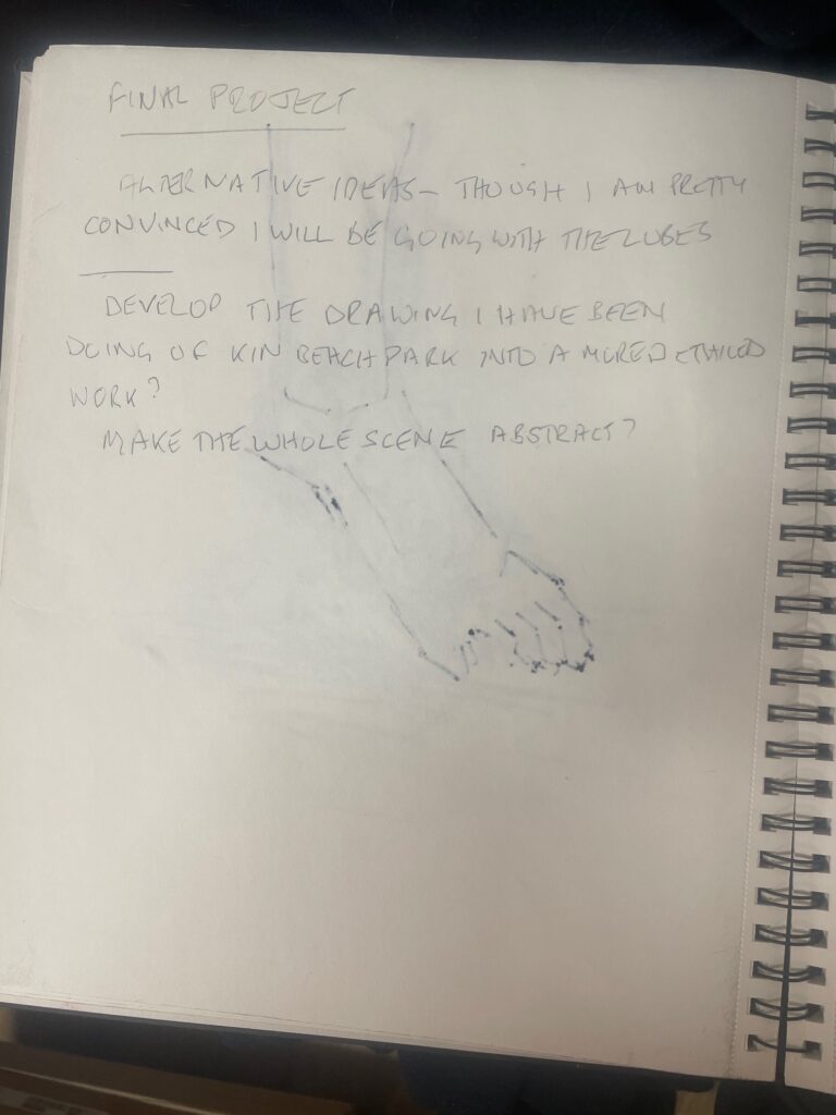
FINAL PROJECT
For our final project in FIN210 – we have a blank canvas – a Tabula Rasa as the Romans would say. Very few rules apart from it must be essentially a drawing . We needed to consider three different ideas and work them up into one final hurrah. Being impetuous I tend to grab an idea and want to run with it – so the two other options felt a bit of a distraction – but it ultimately turns out that there are merits in all sorts of different processes. Linda did ask for 10 pages in the sketchbook but the sketchbook isnt my favorite way of working so this wordpress site will be the substitute.
My first thought was to go back to the very first classes and the work we did on perspective.
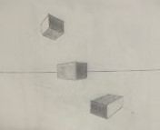

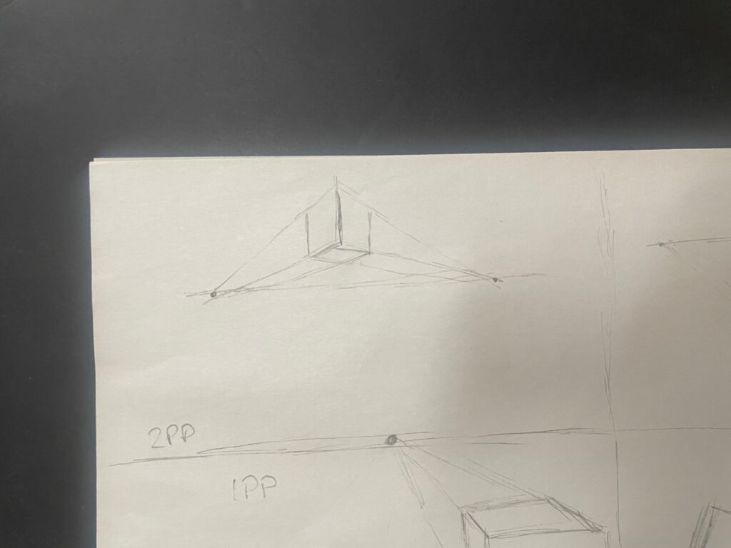
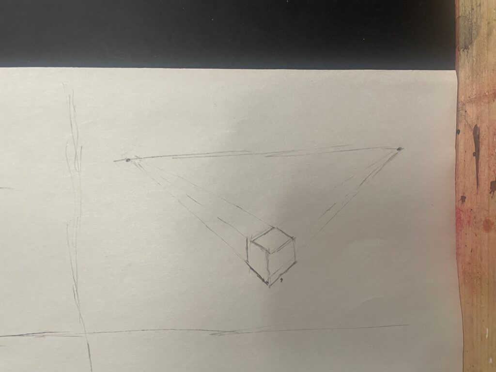
I had a few ideas about that and I had already considered this for the mid term
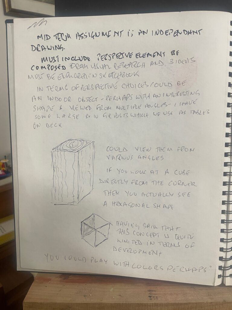

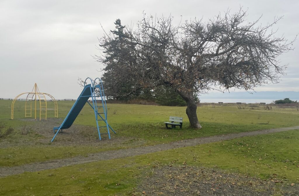
I was pretty struck with this idea straight from the get go – but we needed to also consider two other concepts. The first one was working up the drawing that I have been using for the light studies – which has been a location in kin beach which i like a lot. Perhaps try to do a really good job of working up the image – a challenge to my limited skills…The other was going back to the dreaded vases. Perhaps even making a bisque vase, drawing on it and then breaking it – perhaps more of a performance than a drawing though


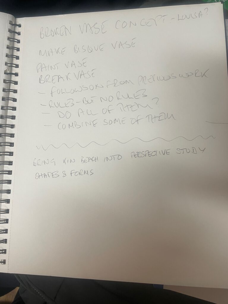
The vase idea did however make me think about the multiple concept – which I was keen on
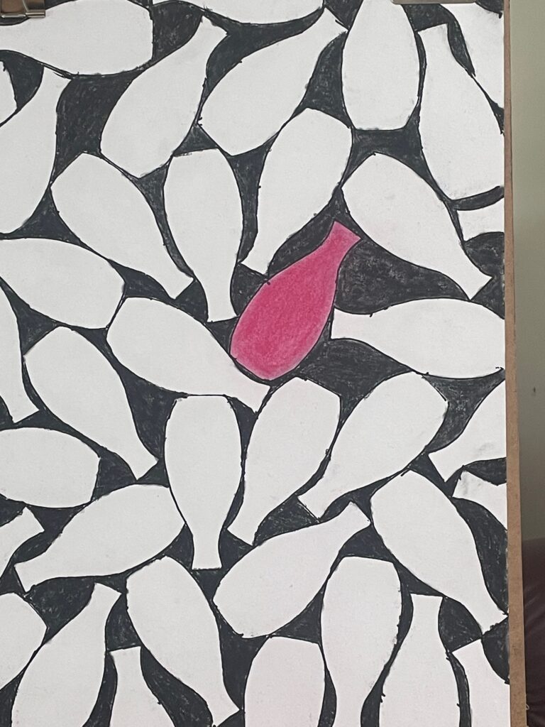
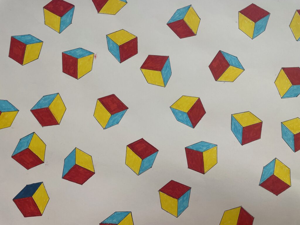
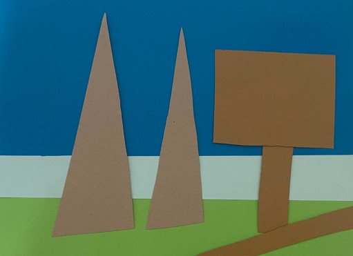
In our in class discussions the germ of an idea was generated about possibly incorporating all theree concepts in some way. Multiple cubes similar to the vases and some link with kin beach. Perhaps a wash of colour with the same sort of pallette as kin beach with some cubes??
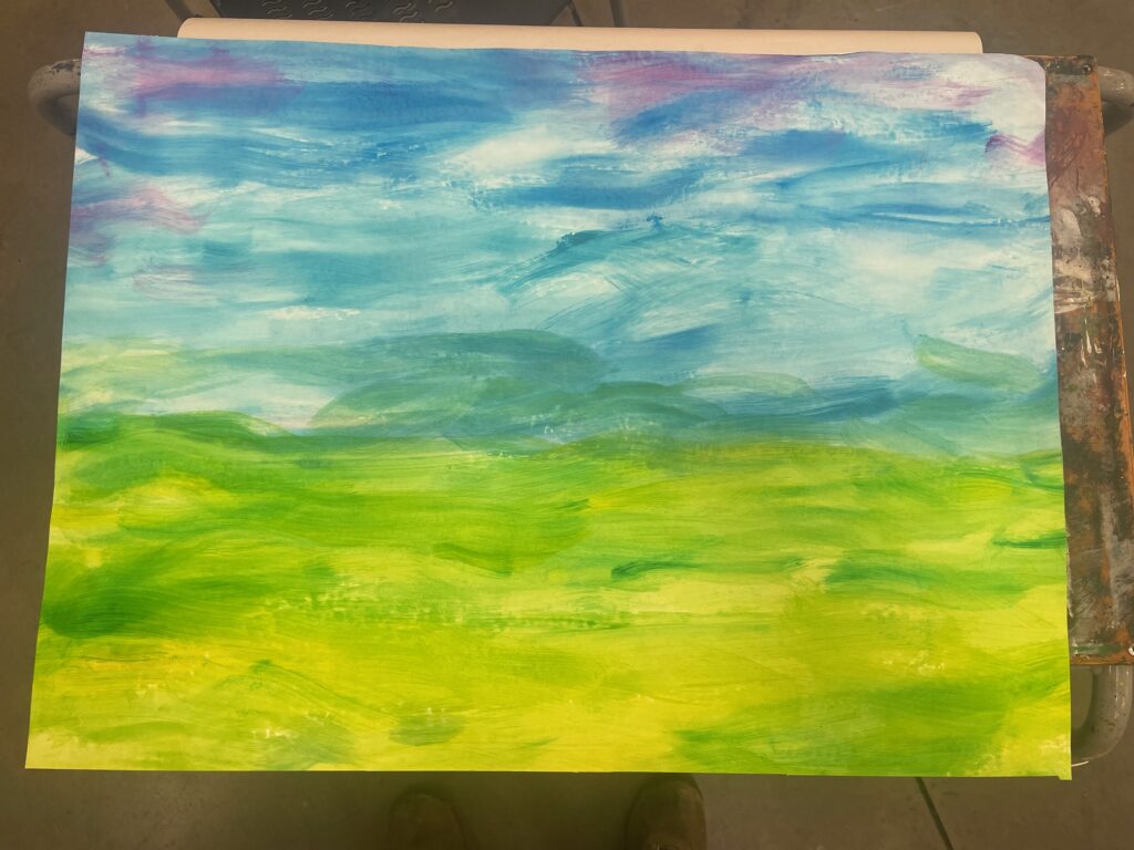

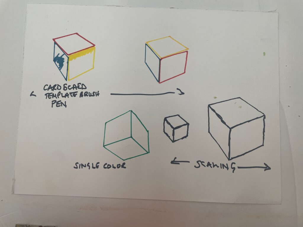
apart from the background the park also has primary colored elements in the playground equipment. First lets try some multiples

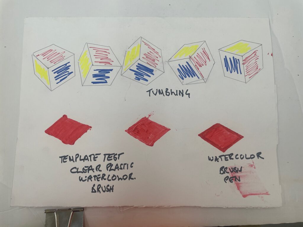
Then what about colors and materials for the cubes? – loads of different options to test
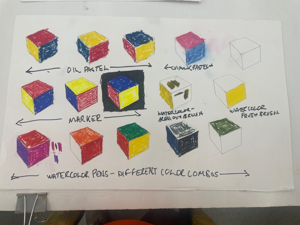
Linda and I discussed cutting cubes from one of the kin beach color washes – which I liked the idea of. Unfortunately the watercolor wash on that particular paper didn’t work at all well for cutting the shapes out which left the multiples. I was looking at using the prinary colors of the playground equipment as the kin beach element . I started with the red

But that then created a bit of a quandry – the red elements took me back to the beardsley art projcet and I wondered whether red black and white might be a better combination??
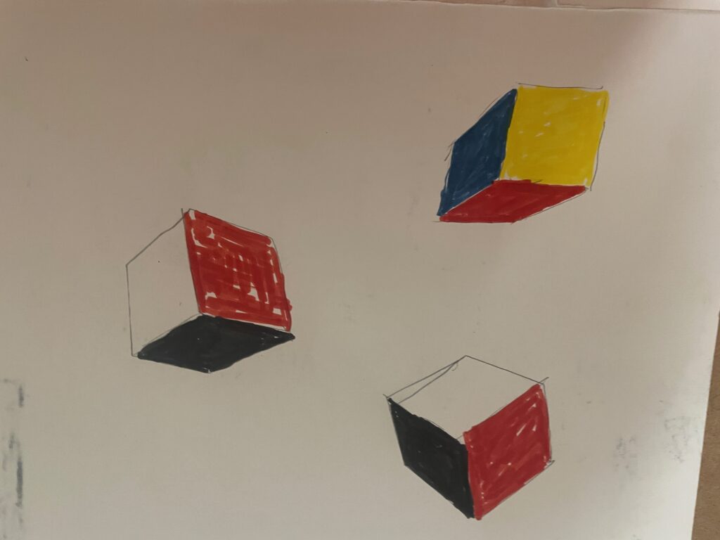
ultimately I went with the three colors – red a yellow went well, but the first blue I selected i felt was too dark and i switched to a lightere more “playground” blue. How to deal with the dark blue?? I considered cutting a light blue shape and collaging it over the dark blue, but decided that having one cube that was slightly different – like having one red vase in that drawing was better – so here we have the final project