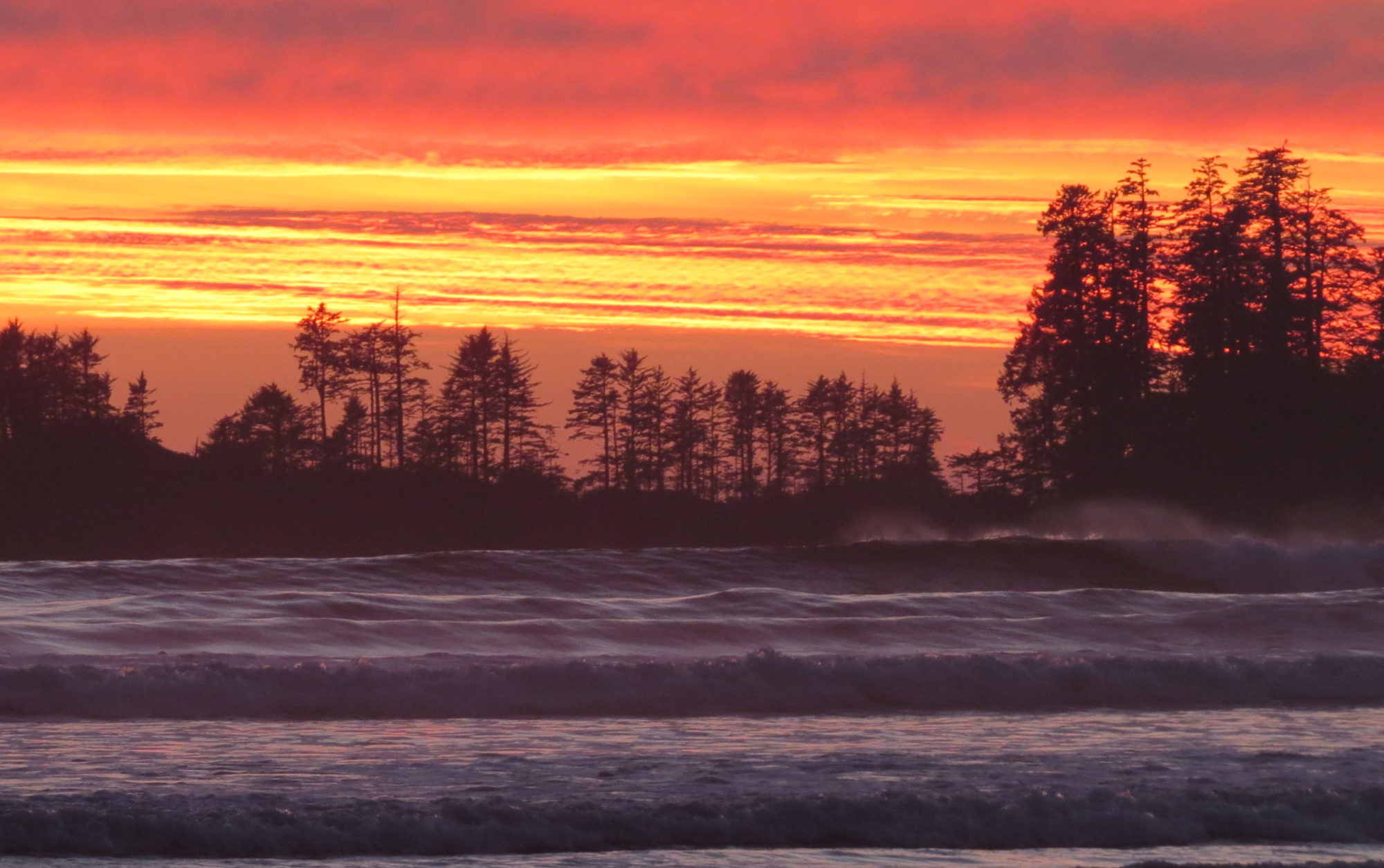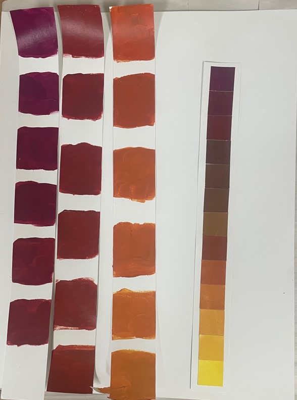
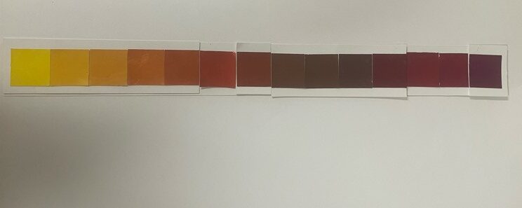
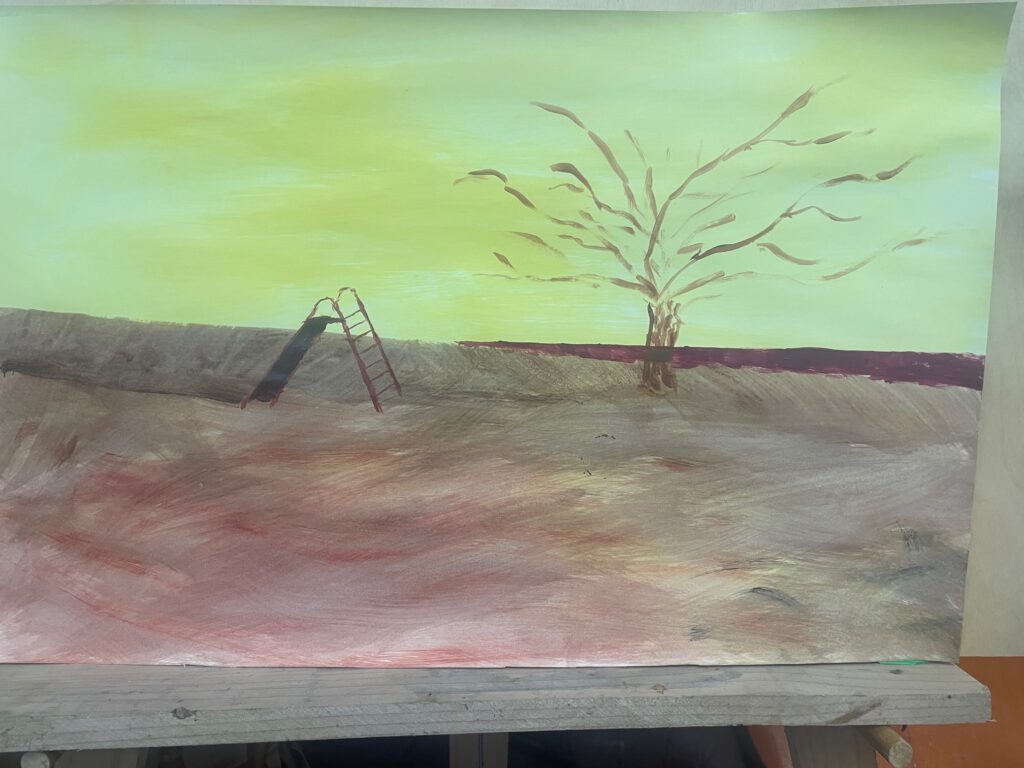
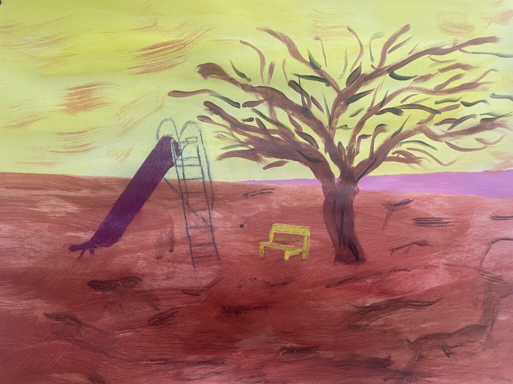
As you can see, and supporting color theory, the violet and yellow have a strong contrast where the swing and the sea both meet the sky. Also lots of different browns were available. By ignoring the yellow / violet ratio of 1:3 for ideal balance you get a more surreal effect, which I hope suits the wild and blustery subject.
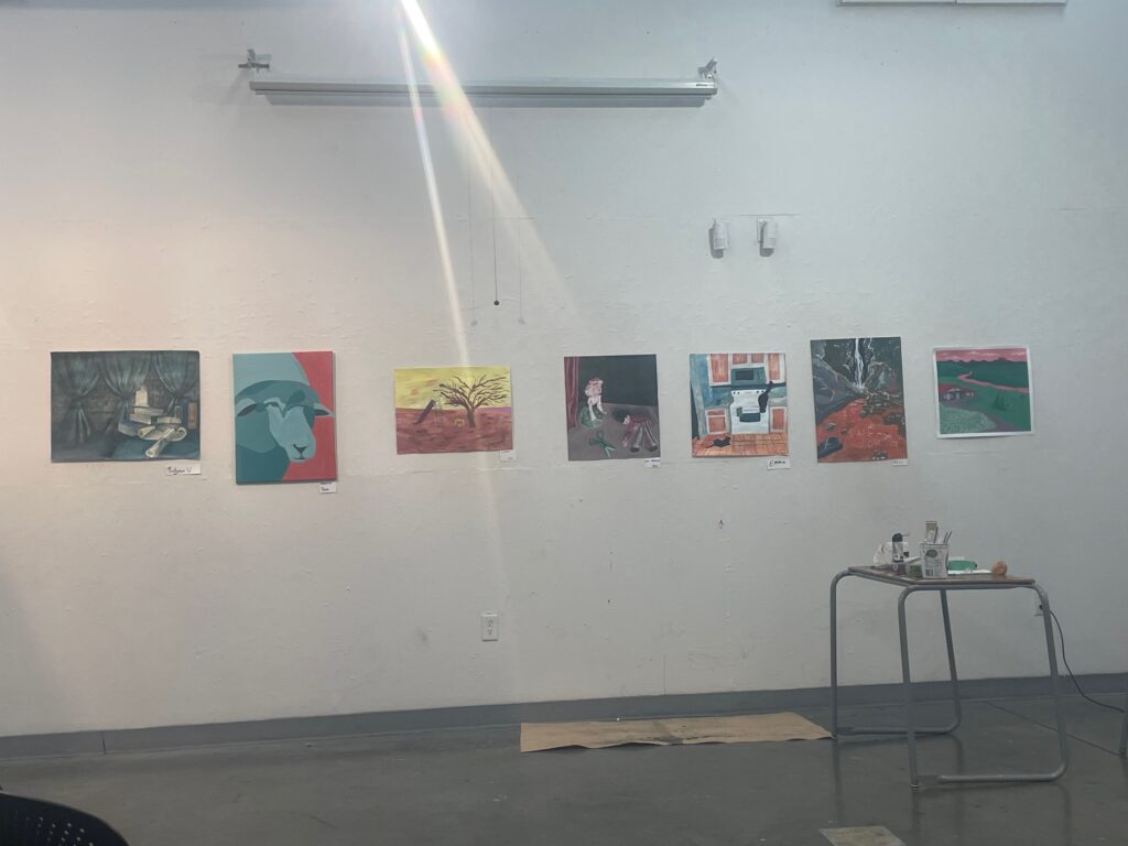
And amazingly here is my painting amongst those of my talented classmates. The streak of light is entirely fortuitous. We had a great final critique and the wide range of ways that the other students tackled the brief in the assignment showed so much creativity. This brings FIN120 to a close. It has been fun all the way through – and a challenge – thanks to Elizabeth and all my classmates who have made it what it was. .
